TL;DR: I designed a mock album cover with the Swiss Style in mind.
The practice of imitating a master’s work is one of the most traditional ways for students to learn. It would help students to practice a skilled method of the art before developing their own approach and style. Many famous artists had employed this process, including Pablo Picasso. This project focuses on the discovery, exploration, and imitation of a key designer whose designs had been influential to a famous art movement in history, and pair it with a suitable music group to create the record art.
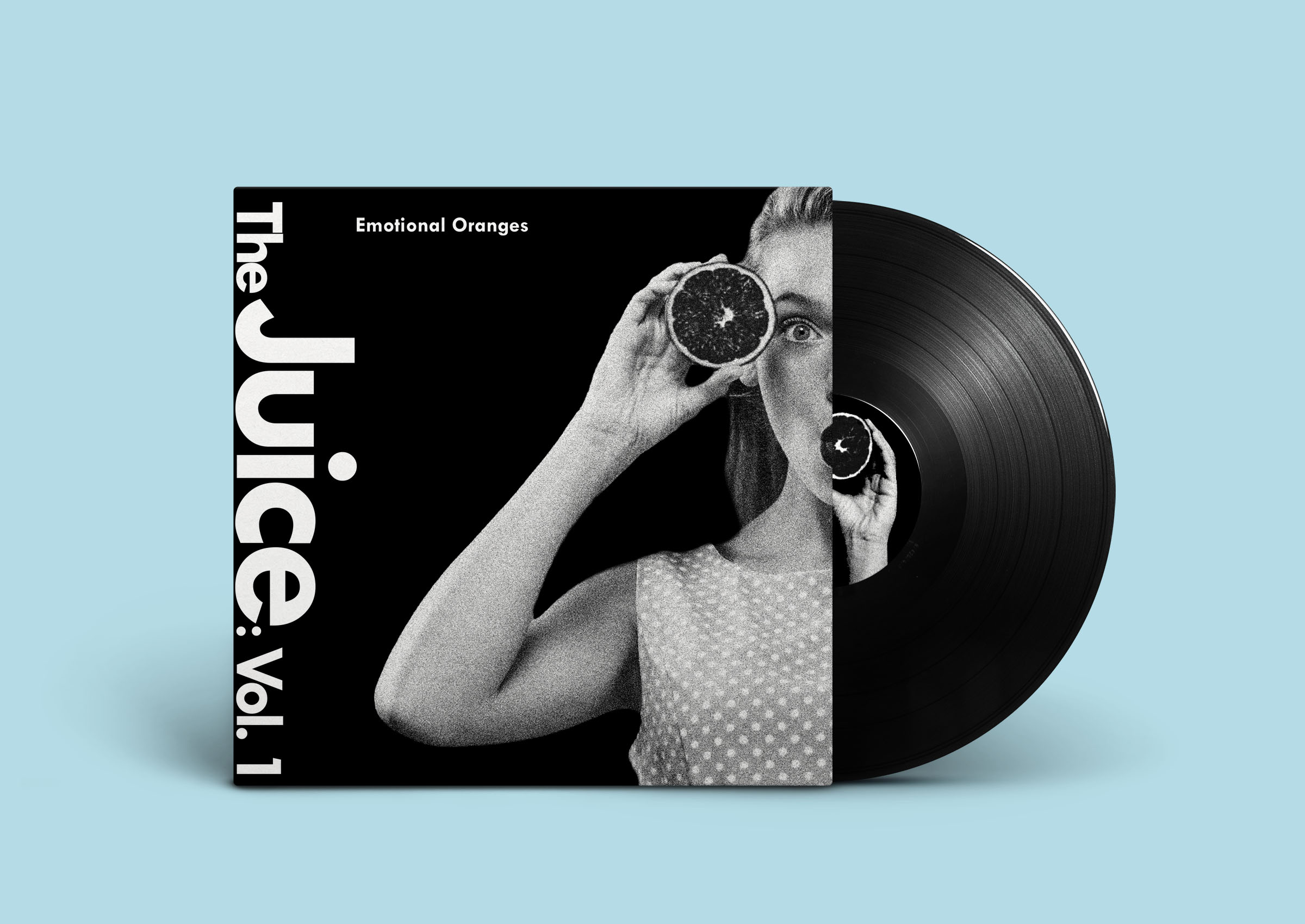
For this project, I chose to imitate the designs of Armin Hofmann, a Swiss graphic designer who was an influential contributor to the International Typographic Style (or the Swiss Style). The International Typographic Style was characterized by the emphasis on cleanliness, readability, and objectivity. It begins with a mathematical grid, as it is considered the “most legible and harmonious means of structuring information.” Text is then applied, usually flushed left/ragged right. The fonts used are mostly sans-serif, which was believed to “express the spirit of a more progressive age.” Objective photography may be used, as opposed to illustrations, which are meant to display information clearly without any sort of bias. As for the music group, I had chosen Emotional Oranges, a pop/rhythm and blues duo band, who are known for their honeyed, yet blunt lyricism. Because of the straightforward, no-nonsense approach of Emotional Oranges’s lyrics, the Swiss Style seemed like the best choice to represent the music group.
Working with this idea of bluntness and straightforward-ness, I chose to imitate one of Hofmann’s most famous posters, Giselle, which was a black and white poster that had a ballerina in motion, the date, address, and “Giselle” in bold font, turned onto its side, and flushed to the left. I took a stockpicture of a woman holding two oranges (to represent Emotional Oranges), made it grayscale, and added noise to add that “grit” that Hofmann had in his poster. The woman was then “split” down the middle, with the left side flushed right for the front cover and the right side flushed left for the back cover to bridge the two covers. The record art is simply the woman’s left hand holding the orange with the same treatment. The font used throughout the entire album cover is Tw Cen MT Bold. The album name, “The Juice: Vol. 1,” is done is mimic the style of “Giselle” from Hofmann’s poster: white, turned onto its side, and flushed to the left side of the front cover, with “Juice” made bigger to give the title more presence. “Emotional Oranges” was done to mimic the date and address on Hofmann’s work, made smaller than the title, but still able to catch your eye.
.png)
.png)
.png)
Ask me anything! Or maybe tell me a story or a joke! I'm all ears!
.png)